The initial presentation of a design concept is a crucial part of winning a job. It’s the way you show the client what could be possible with the client’s needs and wants with in the space as clearly as possible.
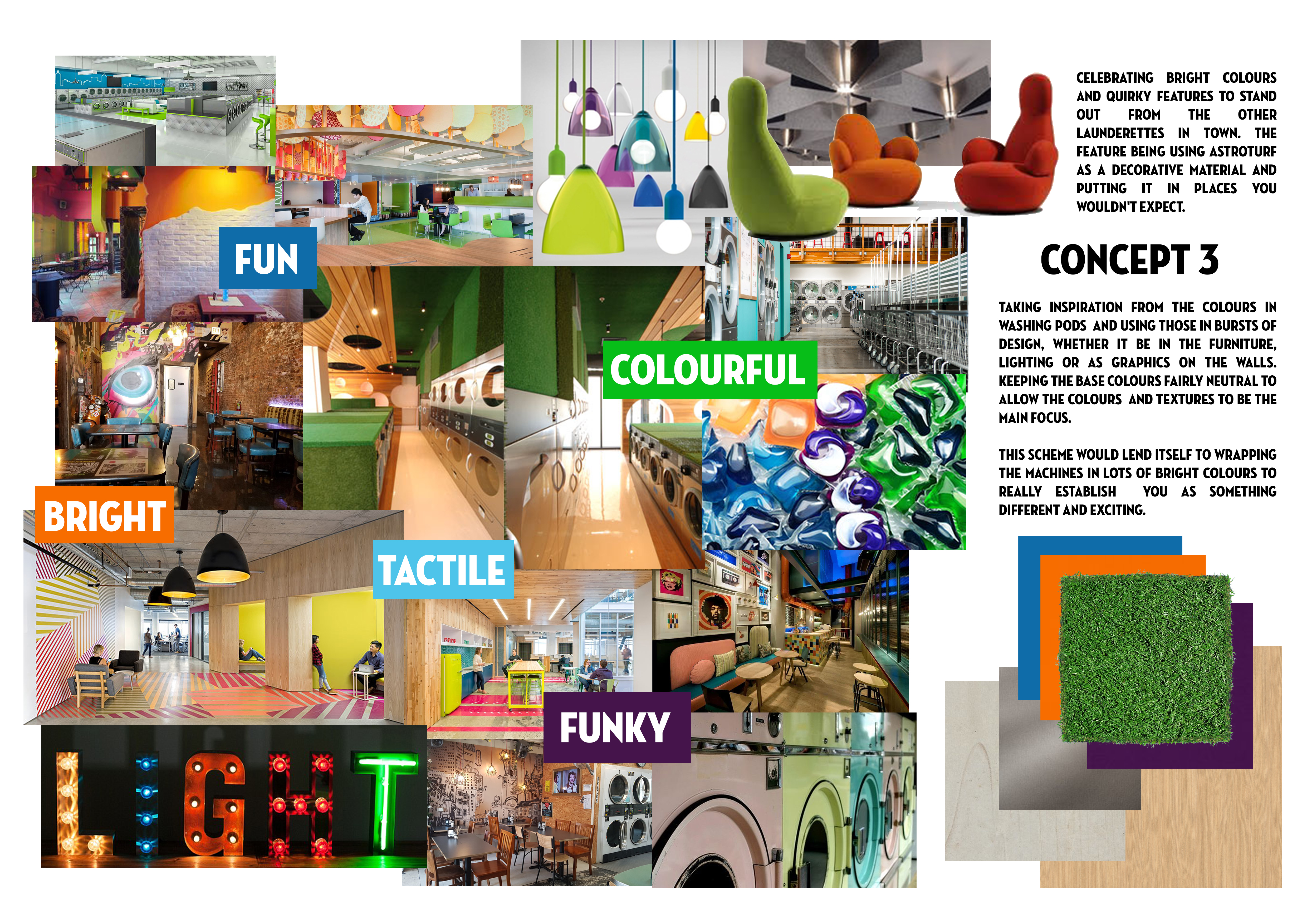
A mood board can be a great way to help explore and visualise a project for yourself and for the client before after the design takes place. Trying to gather up all the ideas and find a way to effectively present them. With a mood board it is mostly conceptual, meaning you’re just looking at colours, examples of furniture and accessories that can be used as inspiration. It’s a great base to design from and get the client’s feedback before the design get fully realised. Having a visual plan like this will provide direction for the rest of the project, speeding up the workflow.

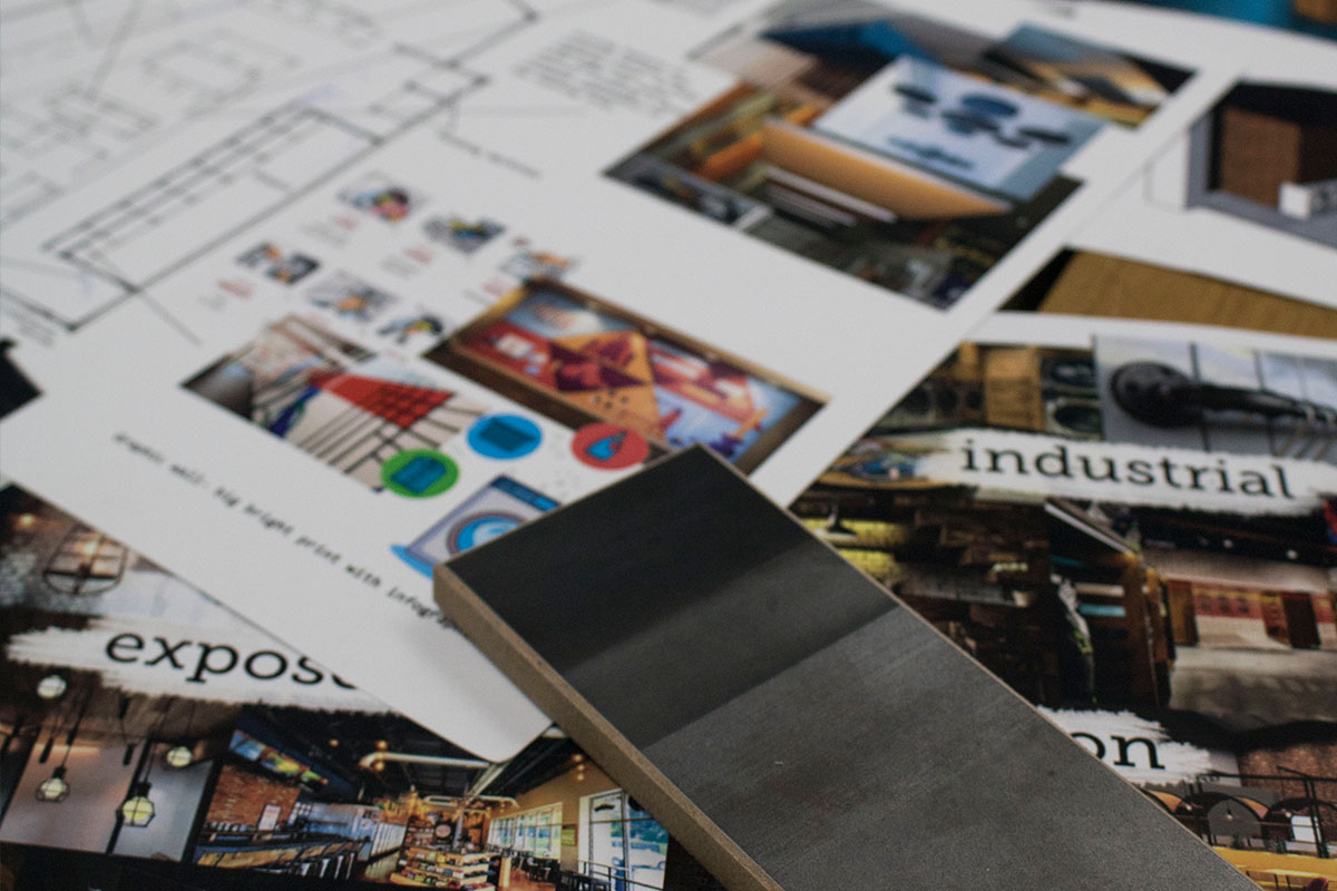
When the design has come further along a sample board can be used to showcase the specific materials and furniture that have been designed into the space. It’s a more thought out combination of actual products that the client can look at and feel. It can include floor plans, sketches, elevation and more to give as clear a vision as possible.
Both types of boards can help enormously with the client. The can help streamline ideas to make designing more focused and potentially save wasted time and effort by getting client approval ahead of the majority of work and planning. It’s also a great aid in a pitch as it helps avoid any miscommunication that may result from purely verbal description.

In both cases there are some tips to achieving an impactful presentation board:
- Use hierarchy. Make sure the main points are at the forefront or our bigger than the other images or sample. For a sample board it’s common practise to lay it out so the floor material is at the bottom and that any elements that will overlap in the design, touch or overlap in the board so you can see how the colours and textures will directly work together.
- Add visual elements that already existing. Including a logo or tagline or existing expressions of the branding and how it is incorporated into the scheme.
- Make sure it’s co-ordinated. If there is more than one ‘zone’ in the space and they want to be different it’s worth creating a different board for different zones. This will help the design be more thought out and interesting and having the boards to look at will ensure coordination throughout without being exactly the same. It will also help when making small tweaks to determine if the will still work with all the other components.
- If you’re working in a team, then ask for feedback. This will help to ensure the board is portraying the right message and vision. But also to make it a collaborative exercise and that way the best ideas will circulate to the top.
- Stay focused. As good as it is to explore different ideas, the board doesn’t want to be confusing for the client. If it’s a big project, then try doing one board per room so it doesn’t’ get too overcrowded and messy. A mood board can show a process- from where the ideas started to a fully formed concept but an onlooker must be able to draw a conclusion from looking at the board.
Presentation boards are a fun part of any project. Testing ideas, colour combination and textures is the best way to get an understanding of what works and what doesn’t. So give it a go and see what you can create!

